VANCOUVER
 Click to view larger image -- if you dare.
And, perhaps worst of all:
These are just a few of the less obscene opinions that I have read today. For those of you who don't know, it is August 29th, which, to a Canucks fan, means that it is uniform unveiling day. Having known what the new uniforms were going to look like for several weeks already, I knew that the reaction would be fairly negative, and was actually looking forward to a rather entertaining reception by fellow Canucks fans and other fans from around the league.
I had to miss the actual unveiling because I was at work, but the first official picture that I saw was this one of Markus Naslund:
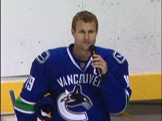
If you hadn't seen them yet, the first thing you probably noticed is the prominent "VANCOUVER" wordmark. Anyone who didn't foresee this as a huge obstacle for fans was obviously dreaming. I, for one, think that Naslund looks very sharp in this picture, and while the uniform is a bit cluttered with the captain's "C" above the wordmark, I definitely see it as an improvement. In fact, I think that it is one of the better new sweaters released this summer under the new league-wide RBK uniform legislation (Boston's being the best - but I'm extremely partial to traditional striping).
To say that I am alone in my positive opinion would not be far from the truth. Forgive me if I don't see the huge problem; I think they look sharp and classy, and they might even have decent staying power. Am I that out of touch? For the record, I'm not for the wordmark or against it per se, but it certainly does not take the jersey from "very nice" to "easily the worst in the league" like someone claimed earlier today. Yes, they're clearly too tight, but every new sweater is.
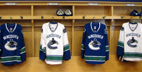
Interesting note: the main Orca logo's colour varies according to the colour of the jersey, much like the vintage logo did, while the modified vintage logo (the new shoulder patch) now consistently comprises a white stick on a blue background.
It's alright... this young man will once again make everyone forget about everything but his glory.
Labels: Hockey
They're growing on me. I hated them at first but they're growing on me. I saw a concept with a green outline on the orca that looked good that I would've liked to see, but other than that I'm starting to like it
Posted by Anonymous |
8:30 p.m.
Anonymous |
8:30 p.m.
Good Post....I have to agree with the general population though that the VANCOUVER on the front is a little much at first. Anyway I think the boys look pretty sharp myself and I definitely look forward to seeing them play soon!
Posted by Anonymous |
11:24 p.m.
Anonymous |
11:24 p.m.